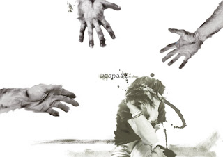
but due to work.. i only came up with 2..
and my lecturer says that these are poor quality work.. and some part i agree some part i dun.. maybe to the fact that i like the concept alot and i wanted to portray that kinda feel.. but he said was good enough..
though i think i really have to go source more photoshop tutorials to strengthen my works..
so here they are.. give ur comments please.. would a 3rd person view of these..


Wad the hell.. blogger just changed color of my image..
those brown/beige color should be black and my despair guys is also suppose to be black and white.. damn..
oh well
another comment my lecturer state is.. my style are always "this" kind.. which i think so too.. advise for me to go on trying other styles..
yeah.. true.. and true. i wanna find more styles that i can do.. hopefully by the next assignment or the final i can produce it..
will be having 2 Weddings in a month.. wow... congrats to both parties.. especially..my good sista... hehehe..
That's all
Crashed

I think the concept was rather nice, I can see how you're isolating certain subjects in your collage to give a sense of despair. I also like how in both pictures, there is someting reaching towards the main subject in the picture (the hands for the first picture and the brown/black border for the second). Somehow the smudges in the brown/black border gave me a feeling of it reaching out towards the tree. Fortunate "accident" perhaps? haha.
ReplyDeleteI think it would have been more interesting if you used colours to portray the emotions instead of just using black and white. In a way it would give more focus to the main parts of your collages.
Like in the second collage, I feel that you're relying very much on the vignetting and the center placement of your tree to make it the focal point of your picture. If you had used a greater variety of colours, you might have been able to come up with a more interesting composition.
About the colour, some of my photos have their colour screwed up too when i upload them. facebook has the same problem. The photos become horribly desaturated. ):
.. yes agree... i think shawn also encounter this problem..
ReplyDeletenice comments... just a little too nice.. not like my lecturer.. whack hard hard one..
yes.. i do admit i suck at colors.. thats y i usually go for black and white.. and i know i need to improve on it.. cant always rely on black and white..
any where to improve..?
The reason why blogger or facebook screw up your picture's cos of your settings in either photoshop or illustrator. Your files should be set to RGB instead of CMYK. If it is rendered in CMYK (stupid) blogger tends to alter the colours dramatically. ;)
ReplyDeleteThe first picture had a really good concept. I mean, I can feel the despair oozing out of the composition. But in my opinion the font spoilt it. You should merge the font with the paint splatters on illustrator, might give you a better feel. Also, black and white might be a very "safe" colour combination to use for something like despair. Try using angry red, hard grey, even rustic brown. The hands are also very detached from the main picture. The whole thing doesn't seem very "connected". Perhaps more blurring, or having paint daubs flow from the hands to the person. It's a little "flat", like, not 3 dimensional.. giving it a 3D effect would be cool. Like the person at the back, the hands at various depths and paint splattered in between. Composition 1 was a really good concept that wasn't followed through. Unfortunate.
The 2nd one didn't really work for me though. Sorry to say that. Haha. Looks like a lot of blurring done to the sky. Collages need not have a "clean" feel, sometimes they look awesome with a very "cut and paste" mentality. Once again the word Lonely spoilt it for me. Haha. Might work better without the text. The grey areas at the sides aren't telling much as well, too empty. Looks too empty in contrast to the vast amount of things happening in the middle. Comes across as incomplete.
Heh. Sorry for the harsh review. LOL! Feel free to bombard my work like that also!! =)
Remember, RGB for web, CMYK for print! =)
YES.... finally... i feel shiok when i see those comment..
ReplyDeleteur comments some how alike with my lecturers.. but he more crazy one.. lolz..
ur doing so much better at ur side.. hehe..
i will buck up... wait and see.. haha..
peace..
Try taking pictures to portray the type of emotion that you would like. I can see that the idea is there but cannot seems to understand why would you wan to make the outline of the hand in the wavy, but hey you are the designer and you should know better than me. I have zero percent for these things.
ReplyDeleteFor the second one i am not sure if i interpret it correct but are you trying to show loneliness?
Is nice, very much like a painting.
Yah like what your friends say, try use colour in. You are good in colour combinations not to worry. I sux in color.
Must teach me your illustrator and PS skills.
I need them